-40%
WOODSTOCK Festival POSTER, Original Hand-Signed by artist Arnold Skolnick RARE
$ 1320
- Description
- Size Guide
Description
Original 1969 WOODSTOCK Festival POSTER, Hand-Signed by artist Arnold Skolnick. This Poster came from a New York antique dealer who knew Arnold Skolnick.After 50 years, the Woodstock Music and Art Fair is remembered for the crowd of some 450,000, the fields of mud from the intermittent rain, the historic rock 'n' roll performances by musicians that went on to become legends, and the festival’s logo: a white bird perched on a blue and green guitar neck against a red background.
Arnold Skolnick, a long-time western Massachusetts resident, was a New York graphic designer and advertising director in 1969. He was approached by Woodstock’s organizers to design a replacement for the festival’s original poster.
“They had the first poster, which nobody liked — it was called Age of Aquarius,” Skolnick said. “They called me in and said, ‘What do you think of this poster?’ I said, ‘Not much.’ They said, ‘Can you do another one?’ I said, ‘When do you need it?’ This was Thursday afternoon. They said, ‘We need it Monday morning.’ So, I said, ‘Fine.’”
The instructions that Skolnick received for the poster’s design were minimal.
“He said, ‘We’re going to have a festival with arts and crafts and music,’” Skolnick said. “And I turned it around to say ‘three days of peace and music.’ So, it started with the words.”
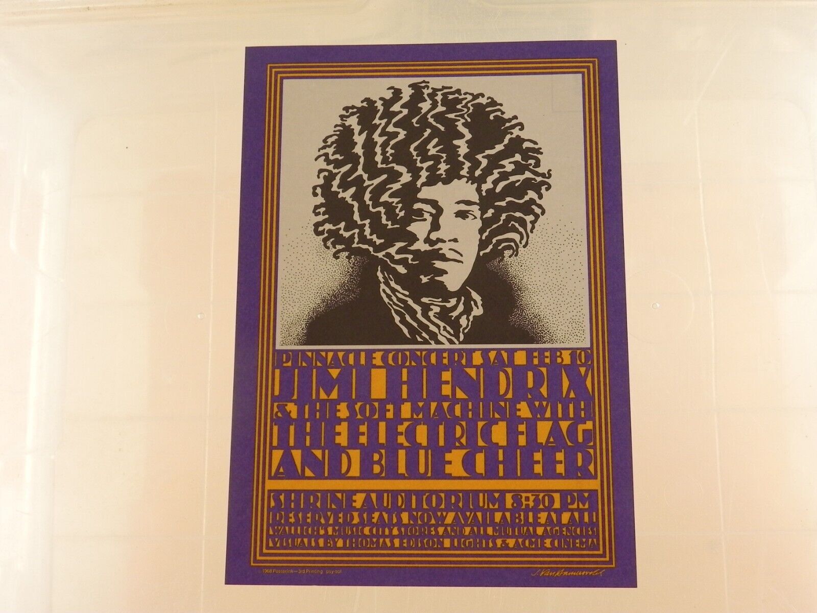
It was the era of elaborately designed posters for rock concerts.
“Everybody was doing psychedelic posters, which I think are awful,” he said. “A poster is supposed to be so simple that if you’re driving by slowly in a car, you can see it.”
Skolnick’s straightforward design featured a guitar and a bird.
“When I did the bird, which is on the upper-left-hand side, you have to balance it,” he said. “So I put the type on the bottom. If it’s balanced, everybody goes, ‘Ohhh. Ohhh.’ If it’s not balanced, it throws everybody off.”
Work on the poster didn’t really begin until the Monday morning it was due. And that bird on the upper-left-hand corner of the poster — the one that for 50 years, I and many others thought looked like a white dove?
“I used a catbird instead of a dove, because a catbird is fat, and a dove is like a pigeon. It has no shape whatsoever,” Skolnick said. “When you say the word peace, you think of a dove. It’s just a symbol.”
Later that morning, Skolnick delivered his design to the Woodstock festival organizers.
“I brought it in around 11 o’clock,” he said. “All the guys are waiting. These are the investors and everybody. They said, ‘Do it! Do it!’ You know... and that was it.
”
“When I did the bird, which is on the upper-left-hand side, you have to balance it,” he said. “So I put the type on the bottom. If it’s balanced, everybody goes, ‘Ohhh. Ohhh.’ If it’s not balanced, it throws everybody off.”
Work on the poster didn’t really begin until the Monday morning it was due. And that bird on the upper-left-hand corner of the poster — the one that for 50 years, I and many others thought looked like a white dove?
“I used a catbird instead of a dove, because a catbird is fat, and a dove is like a pigeon. It has no shape whatsoever,” Skolnick said. “When you say the word peace, you think of a dove. It’s just a symbol.”
Later that morning, Skolnick delivered his design to the Woodstock festival organizers.
“I brought it in around 11 o’clock,” he said. “All the guys are waiting. These are the investors and everybody. They said, ‘Do it! Do it!’ You know... and that was it.”
For his design, which has endured for 50 years, and is so identified with Woodstock, Skolnick was supposed to get royalties.
“Two percent of everything,” he said. “Two percent of everything was , according to their calculations. I didn’t do it for the money — just solve the problem, that’s what I was doing it for. I think about solving problems, visually.”


